New Year, New Hue | Color Trends for 2024
Brooke Cleaver November 15, 2023
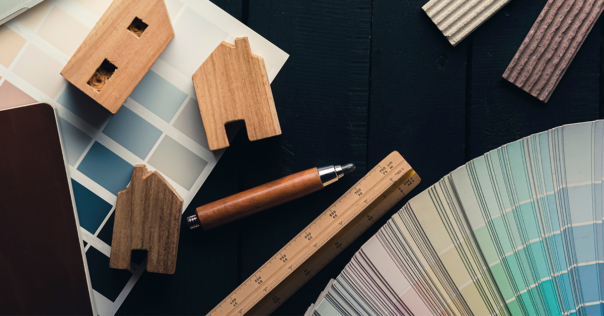
It's November, which can only mean one thing: it's time to start examining all of the upcoming color trends for 2024. Every fall, like clockwork, paint and design experts come together to unveil their top picks for Color of the Year – and every year, leaders and experts from all industries study and gauge how these picks will change the interior design landscape for years to come.
Last year, we saw a return to nature with warm neutrals, relaxed earth tones, and bold burgundies. Looking ahead at the coming year, a new theme emerges, one focused on self-care and personalization. Harness the power of individuality through the moody mid-tones, uplifting hues, and out-of-this-world blues of 2024.
Find Comfort in Ironside by Dutch Boy
Elegant and Poised, Dutch Boy's prized color, Ironside, is the perfect neutral – in more ways than one. Not only does it play on the ideal combination of warm and cool temperatures, it also captures the ideal spectrum of light as the perfect mid-tone.
 Photo: Courtesy of Dutch Boy® Paints
Moody yet playful, Ironside is a great choice for those wishing to dip their toes in the dark and dramatic paint pool. Recent design trends, such as the Dark Academia aesthetic and soft goth movement, have increased the need for sophisticated pallets that invite comfort and donnish charm. Ironside, with its dark brown undertones and olive green hues, strikes just the right balance. It's light enough to bathe your space in a soothing finish but mysterious enough to tease the senses and encourage thoughtful reflection.
Now, invite the spirit of the sea into your home and wrap your walls in its soothing embrace through the sophisticated colorways of Ironside.

Go Timeless with Cracked Pepper by Behr
Last year, Behr asked us to begin anew with their show-stopping color, Blank Canvas. This year, they sprinkled in a dash of timeless charm with their bold yet versatile color: Cracked Pepper. Much like Dutch Boy's Ironside, this confident neutral answers the call for a darker, more sophisticated selection of colors. Chalk full of modern appeal and timeless beauty, this soft black blends effortlessly with any and every design style, making it a versatile tool against a sea of ever-changing trends.
 Photo: Courtesy of Behr
Much like how the little black dress never goes out of style, the elegant hues of Cracked Pepper are designed to accommodate a wide range of styles and design preferences, making it a long-lasting option for designers and homeowners alike. What's more, the soft nature of this malleable neutral makes it a great introductory option for those seeking to balance their space with richer, more romantic tones.

Rise Above with Upward by Sherwin-Williams
Easy, breezy, beautiful. Not Cover Girl. This enchanting shade of blue invites you to slow down and live amongst the clouds. Self-described as relaxed and carefree, Sherwin-Williams' Upward is a breezy yet blissful blue that echoes the sky on a hot summer's day. Brighten your senses and wrap your home in eternal sunshine with the captivating violet undertones of Upward. Sherwin-Williams' prized color offers a sense of serenity, not easily found. "With this color, we invite our consumers to take a pause and infuse a new sense of ease and possibility into their spaces – one that doesn't overwhelm, but rather establishes meditation and tranquility," says Sue Wadden, director of color marketing at Sherwin-Williams.
 Photo: Courtesy of Sherwin-Williams
What's more, the subtle, understated beauty of Upward makes it a versatile choice. Be bold and make a statement by isolating, or create a more subdued yet equally inspiring look with similar tones, perfect for styles that evoke a sense of cleanliness and comfort.

Overcome Obstacles with Limitless by Glidden & PPG
Aptly named, this honey-toned neutral invites a sense of optimism and introspection through its rose-colored undertones and cheery disposition. Reminiscent of the sky at golden hour, this pale, almost yellow beige lends itself beautifully to virtually any and every color. As we continue to move away from cool grays and more towards an organic blend of warm shades - similar to that of the natural world, you can expect to see a growing number of people incorporate colors like Limitless in their design arsenal: colors that evoke a sense of comfort and warmth. Overcome the toughest of design obstacles with Limitless, a versatile neutral that invites comfort and warmth.

Reach for the Stars with Blue Nova by Benjamin Moore
With its ethereal blend of blue and violet, Benjamin Moore's color of the year, Blue Nova, encourages us to reach for the stars. Inspired by the cosmos, this mystical array of hues beckons you to travel to worlds unseen, both in the literal and figurative sense. In a sea of earth tones and nature-inspired motifs, Benjamin Moore encourages you to make choices that are quite literally "out of this world.". Think outside the box and embrace the dreamy undertones of Blue Nova by placing it on all four walls or by using it as a creative accent piece.

Shiver with Anticipation for Pantone’s Color of the Year
Last year, Pantone dazzled us with its powerful yet empowering choice, Viva Magenta, which encouraged us to live bravely through the expression of color. And boy, did they get it right. In the year of Barbie, Viva Magenta, and tones like it, stood out as a stunning reflection of the current zeitgeist. More than ever, people have been craving to reach a level of expression that is both bold and authentic. And it's with colors such as Viva Magenta that people are allowed to do so. Which begs the question. What does Pantone have up their sleeve for this upcoming season?
Forecasters at WGSN and Coloro predict that orange will make a comeback with their top pick, Apricot Crush, a natural and playful shade of amber that tantalizes the senses. According to the experts over at WGSN, "Cultivating a hopeful and positive mindset has become a powerful coping mechanism for consumers," and colors like Apricot Crush help build a sense of care, connection, and community that people are craving.
Which brings us back to the question at hand: Will Pantone follow suit and choose a playful orange similar Apricot Crush, or will they have something completely different up their sleeve? We’ll just have to wait and see what Pantone will bring.
Final Thoughts
What are your thoughts on the new Colors of the Year? Which ones stand out to you the most, and what plans do you have for incorporating these colors into your spaces? We’d love to hear from you. Join us over on Instagram, Facebook, and LinkedIn to discuss your top picks for the upcoming year!
Lafayette Interior Fashions is a family-owned, to-the-trade manufacturer of blinds, shades, shutters, draperies, and other custom-crafted interior fashion products. To learn more about our products, Find a local dealer near you
