Materials Library


Design Considerations
Color, Pattern, Texture & Shape
The Color Wheel:

Red, yellow, & blue.

Green, orange, & purple. These are created from the primary.

Colors that are adjacent on the color wheel.

Colors that are opposite on the color wheel.
Basic Color Theory:
There are three vital parts to color: the subject, the light source, and the viewer.
- The Subject - Different materials will absorb light in a different way. A flat, smooth surface will often times reflect an even color because the light is reflected very directly; however a rough, rounded object will reflect the light in various directions. Think fabric, textures, and sheen. For instance with sheers, when the fabric is gathered the color is more intense compared to a flat sample.
- The Light Source - This is why exact matching fabrics is next to impossible. It’s more practical to expect an acceptable match, one that is pleasing to the eye and depends on the end use. Two items may appear to match exactly under an incandescent lamp, but not under a fluorescent lamp. This is referred to as metamerism or a metameric pair.
- The Viewer - You know the saying “in the eye of the beholder”? Well, color may truly be in the brain of the beholder. Color perception is determined by how we process the images we see and let’s face it, no two of us are alike.
Hue, Value, & Saturation
Hue – Hue = color. From red to yellow to blue and everything in between, it’s the basic color families.

Value – from light to dark.

Saturation – also known as Chroma. When a color is referred to as “clean” it means brighter or clearer. Dirty colors tend to be more grayed out or even “muddy” looking.

Tints, Tones, & Shades
 Tints = Hue + white.
Tones = Hue+ gray.
Shades = Hue + black.
More importantly than the understanding of basic color theory, is to remember that color is personal. It’s how it makes you feel. The inspiration can come from anywhere – nature or a beloved piece of artwork.
High impact hues will amp up the energy of a room. Inky, dark tones will bring it all in close, making the space feel cozy and intimate. Think about wrapping up in a blanket with a good book, on a rainy day.
What about Neutrals, right? They are often the basis for most designs, think timeless, classic, perhaps minimalist. This also makes it easy to accessorize with pops of color through pillows, top treatments or drapery panels.
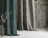
Pattern & Texture
Patterns can really help a room from falling flat or hitting one note. If a neutral palette is your thing, great, but now try mixing more patterns in varying scales and styles. Adding in textures brings yet another layer of visual interest. When picking patterns it never hurts to pick the obvious coordinate, but mix it up by trying out unexpected combinations you may not normally think of. You might be pleasantly surprised.
Shape
Shapes are transformative. There is no better way to make a room seem as though it’s something it’s not. For instance, shaped cornices can disguise or compliment the architecture. If the room seems small, think vertical lines, as in long drapes mounted near the ceiling. This creates an elegant grander ambiance which in turn heightens the look of the room.
If you have the opposite design dilemma & the ceiling s are very tall, think horizontal lines to visually bring the ceiling down.
 LAF_SHADE_PANEL.jpg_h3900-w2700.jpg)
 LAF_SHADE_PANEL.jpg_h3900-w2700.jpg)
 LAF_SHADE_PANEL.jpg_h3900-w2700.jpg)
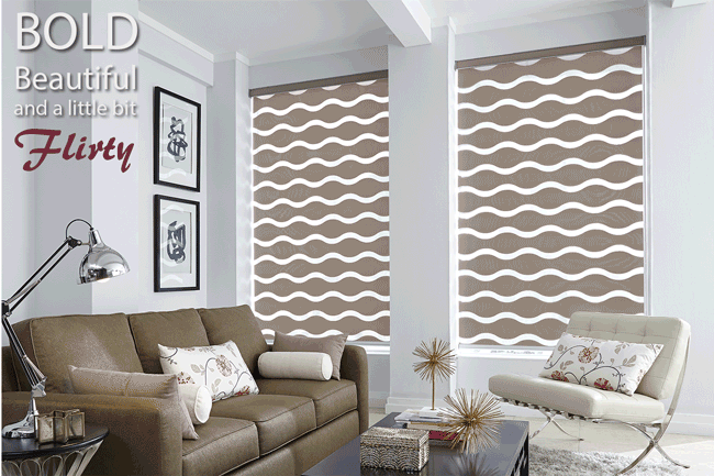
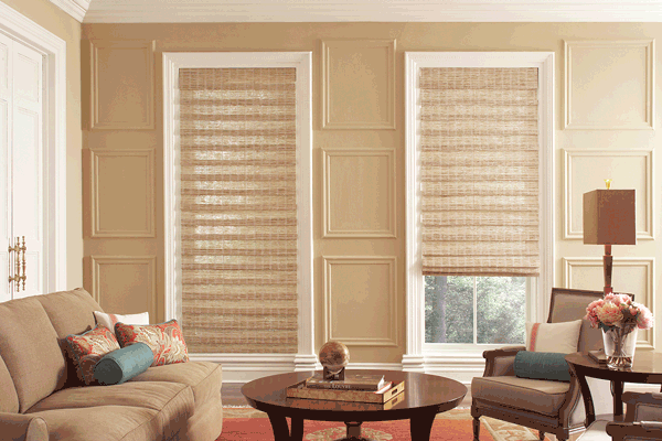
Create a dramatic space with uniquley shaped vanes from Allure Transitional Shades